Calendar Pro Redesign
Overview
Challenge

Introduction
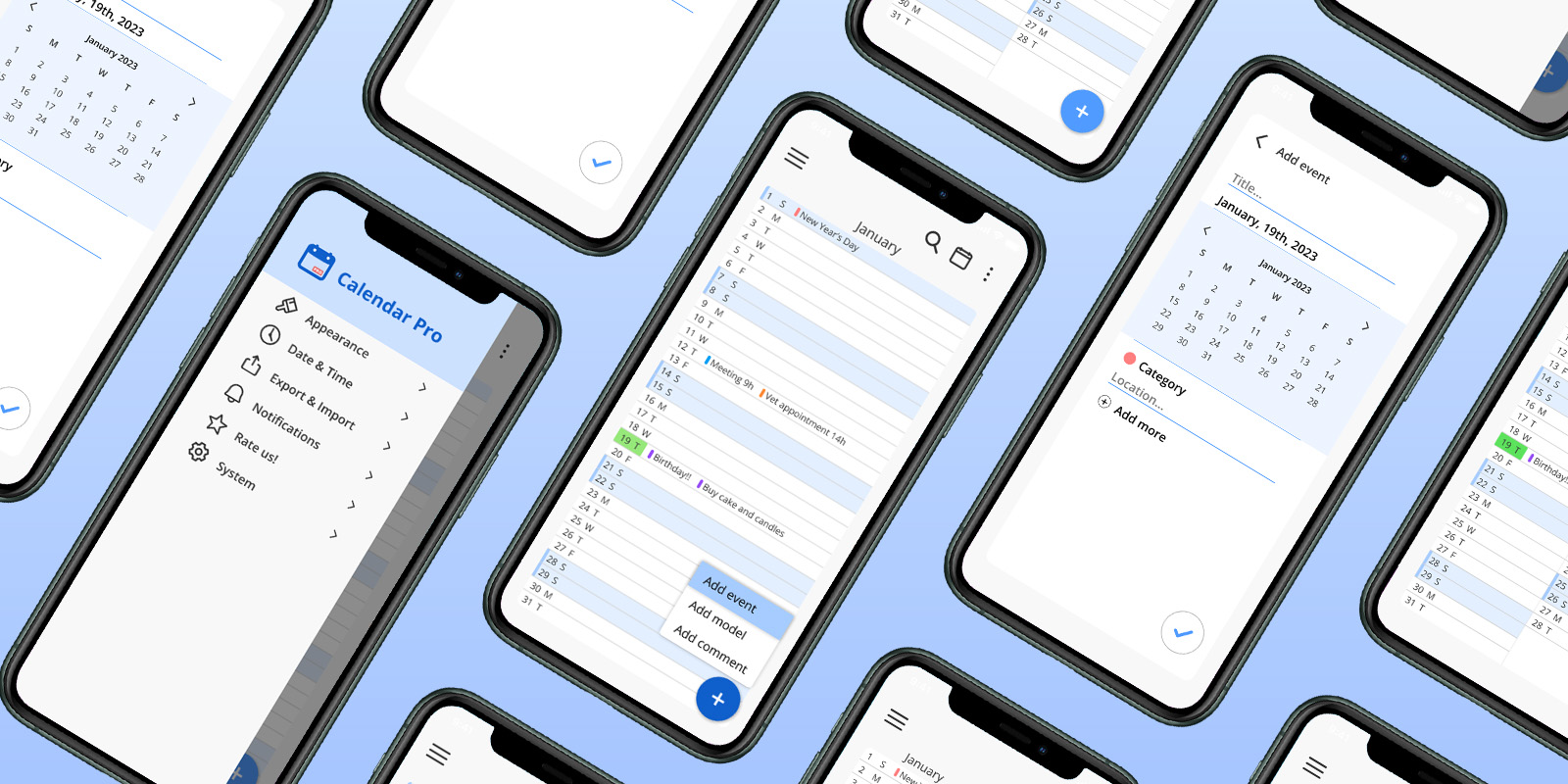
This is a personal project where I chose to redesign an app that I use daily, the Calendar Pro app. The redesign is completely based on my experience as a designer, user and also on further analysis and research conducted by me, aiming to achieve a more refined result to a better experience on the product.
Considering that the only type of calendar that works for me is the vertical one, which is basically a list of the days of the month (or months) that gives me a full vision of tasks and events that I have in that period, the app was an immediate match for the issues that I had while using other options that usually only have traditional monthly and weekly view. The app has been a part of my routine for more than a year and has been my main organization platform since I downloaded it for the first time.
Process
Product Analysis
Pain Points
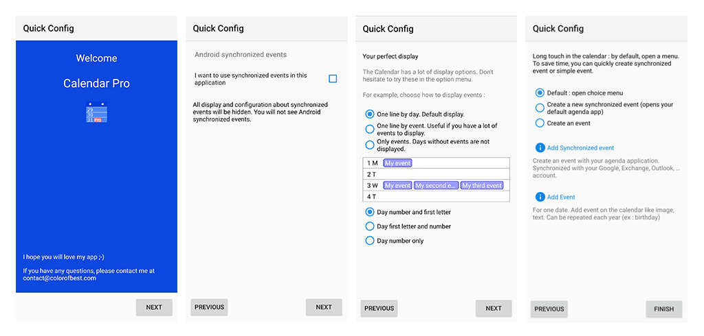
- Excessive Customization: There were some possibilities of improvement regarding one of the usability heuristics: Flexibility and efficiency of use. As much as the product wants to give the user full control of its elements, allowing a big number of choices regarding its visual aspects, this degree of flexibility feels overwhelming since the very beggining where the app asks for customization choices before showcasing its functionalities.

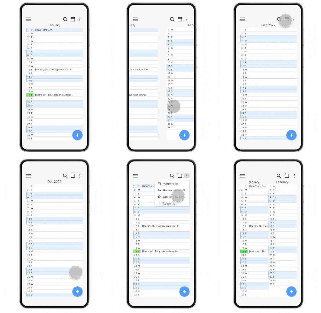
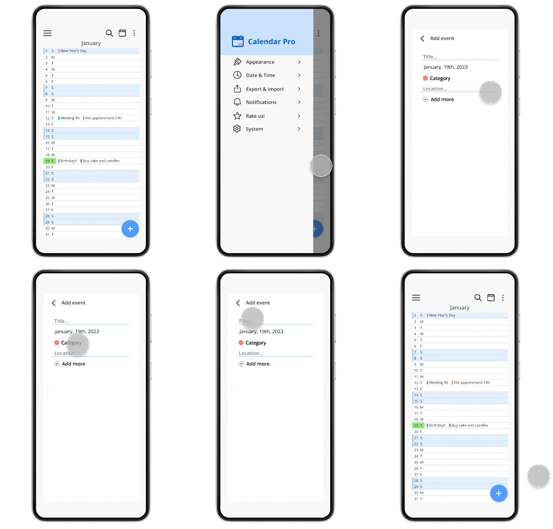
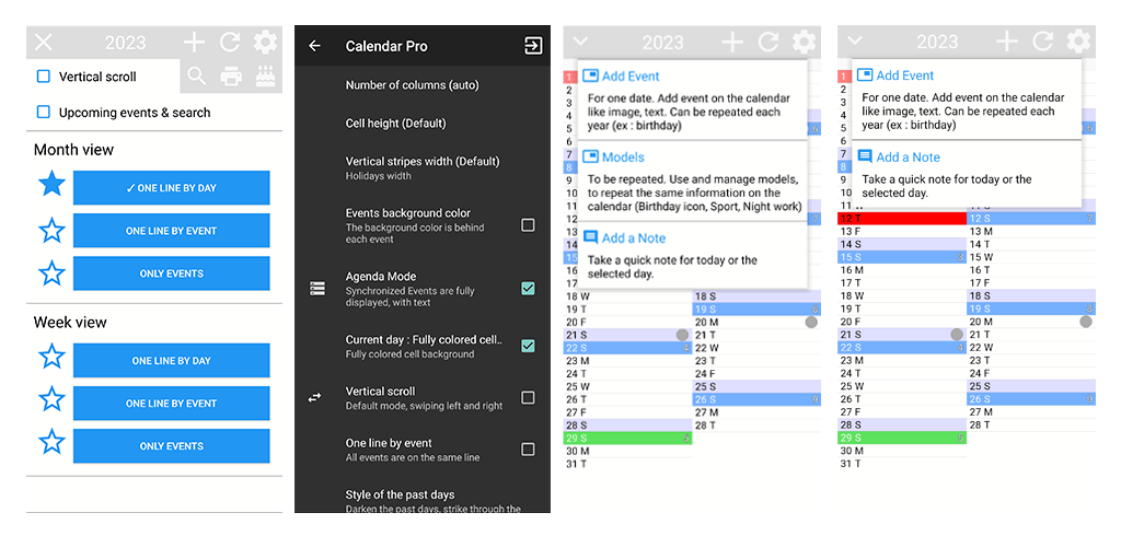
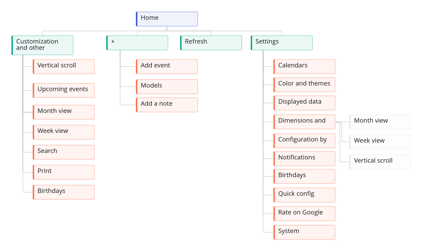
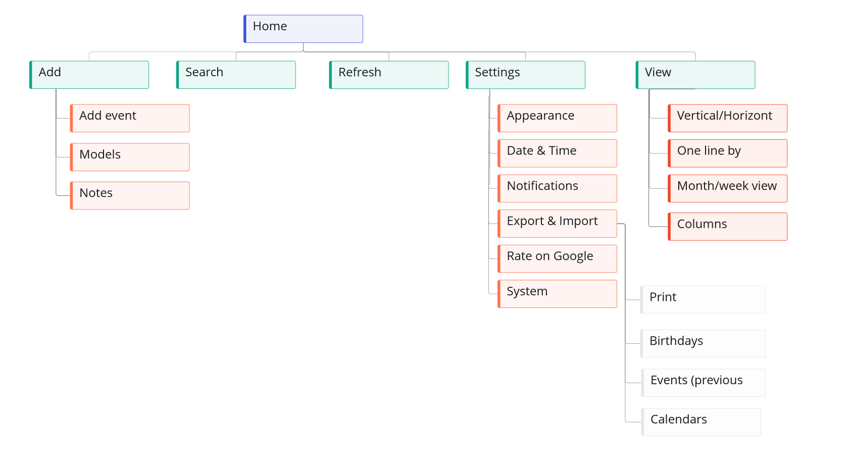
- Overlapping features: After the initial screens, its is possible to find more customization options and some of them even appear at different places of the interface, making the navigation confusing. On the dropdown menu that is placed on the upper left corner it’s possible to find options to customize the layout, and they also appear on the settings menu. To add a event you can either tap on the “+” button on the app’s top bar or keep pressing a date to open the event menu.

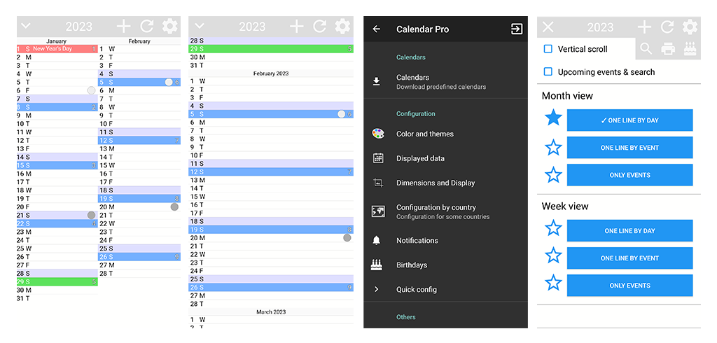
- Visual choices: The color scheme with bold colors and the lack of white space are probably the aspects that are first perceived. The incosistency between the light background and dark settings bakground is also an important point of attention. And last, but no least, the choice for stars as a symbol instead of radio buttons is not user-friendly.

Competitive Analysis
- unique value proposition: highly customizable offline calendar with no complicated features or unnecessary permissions and ads.
- sign up and login: no account or login is necessary.
- performing the main task: to add an event you have to click the “+” button on the inferior right side of the screen. after this, you can define a title, a location, a description, duration in hours, set an alarm, define if it is a recurrent event and setting its type, which corresponds to a color. after that you click on the check that is located on the menu bar to save the event. this is the only way to add an event; if you click on a date before clicking the + button, it brings you to the date page, but you still have to press the plus to add an event on that day.
- customization features: colors (pro), language (pro), time format, first day of the week, reminders, data visualization (daily, weekly, monthly, yearly, simple event list, monthly and daily (pro)) and some specificities for each one, widgets;
- tone: simple, the app is not conversational
- interface: orange menu bar and add event button with dark gray background and white typography and visual elements. the color of the event type element is customizable, where it’s possible to choose from a color picker. further customization could not be tested because it was a paid feature, but on the paid version page it states that you can fully customize the theme changing the text, background, primary, and app icon color. you can also apply the same color configuration to all the other apps from the same developer.
additional note: the app is not updated anymore, only its paid version (Simple Calendar Pro). some features like color and language customization, importing settings and syncing with caldav are only available on the paid version.
- unique value proposition: “the simplest calendar app”, simple and easy-to-use with no extra features. 4.9/5 star on play store
- sign up and login: no account or login is necessary. you need a google account to backup and restore data
- performing the main task: to add an event you have to click the “+” button on the inferior right side of the screen. after this, you can define a title, a date a description, duration in hours, a color and you can also choose the option “add items”, where you can add more dates to the same event and/or add a note. after that, you click on the “check” button to save the event. this is the only way to add an event; if you click on a date before clicking the + button, it brings you to the date page, but you still have to press the plus to add an event on that day.
- customization features: theme (you can choose between light and dark mode), start day of the week (saturday, sunday and monday).
- tone: direct, not conversational
- interface: the standard interface is the light mode, which has a white background, dark and light gray fonts (depending of the type of the text) and dark yellow buttons. at the bottom of the screen there is an add section.
- unique value proposition: effective and free task tracker and to-do list task manager and schedule planner. “easy and beautiful”; “user-friendly”;
- sign up and login: the app offers the option to sign in with an e-mail or google account; there is also an “other” option, which shows you the alternative to sign in with a facebook or twitter account. you can also skip this process and access the app without an account. after the sign up process (or if you skipped it), the app shows a screen where you can pick the purpose or purposes for the app, with the question: “what do you want to create?” followed by these options: work, personal, shopping, learning, wishlist, fitness and birthday. you can choose multiple options or skip the question.
- performing the main task: to add a task you have to click the “+” button on the inferior right side of the screen. after this, you can describe your task and define some aspects like a deadline, priority, a tag and the task list (Inbox and Welcome are the standard lists). after that, you click on the arrow button to save the task, that goes straight to the top of the list. you can click on the check box after the task is complete, when you do that an arrow button appears for a brief period of time on the left inferior side of the screen for you to undo the action. this is the only way to add a task; after adding tasks you can perform some actions on them by swiping over them: if you swipe right you can mark a task as complete or pin a task, if you swipe left you either move the task to another list, delete it or change its deadline.
- customization features: tab bar (you can choose up to 5 features to appear on the tab bar, more than that the icons will appear inside a three-dot hidden menu/available features: task, eisenhower matrix, pomodoro, habit tracker, calendar, setting, search); appearance (theme option with and without illustrations, icon colors and styles (premium feature), font size, sidebar count and completed task style); you can show or hide the details on tasks; show or hide the completed tasks; change the view (list, kanban or timeline (pro)); you can also customize the deadline options, prioritizing the options that are recurrently used to have an easier access to them. overall, the app gives the user a lot of customization power.
- tone: direct, first steps have a conversational tone with the use of human illustrations; the use of emojis on the example tasks give the product a lighter tone;
- interface: the theme follows the system’s mode. light theme has a light blue background, dark gray font with white boxes that segregate each type of content; add task button, menu header and some setting icons are blue; icons also appear green and light orange;
- unique value proposition: daily schedule planner, task organizer, to-do reminder app, calendar. “user-friendly and small size” “effective and free task tracker and to do list tasks manager to help you manage time and enjoy an easy life. 4.9/5 stars on play store
- sign up and login: no account or login is necessary. you can choose to sync with google drive
- performing the main task: to add a task you have to click the “+” button on the inferior right side of the screen. after this, you can describe your task and define some aspects like a category, a deadline (date, time, recurrency and notification), subtasks or choose a template. after that, you click on the arrow button to save the task, which then shows you a tutorial of what actions you can perform on a task by swiping or dragging it. by swiping left you can mark the task with a star, change its date or delete it; by swiping right you can mark it as complete. on the upper section of the app there are categories that you can choose and create the tasks inside of them.
- customization features: you can create and manage the categories that are shown on the home page; you can sort the tasks by due date, creation time, alphabetical and manual; you can choose between themes with different accent colors and in the pro version you can add texture, scenery and upload your own images to the app. you can also change the first day of the week, time format, date format and the standard due date
- tone: conversational tone, welcomes you into the app; yellow speech bubble suggests some actions to take, like adding a task (“click here to create your first task”); app suggests good habits to track (“let us start with some good habits?”); when you complete all your tasks the app congratulates you with a message that shows up with a human illustration (“so proud of you, all the tasks completed”). each category has a different illustration, always showing a person performing some action that has something to do with the category. there are tips along all the app that suggest an action you can perform and how to do it;
- interface: app icon with motion on opening screen; shows a “special offer” for new user before going to the app; motion on the arrows that are on the “continue” button to purchase the premium version; human illustration on the first screen, when you have no tasks yet. add task button with motion; standard theme has a white background with dark gray font text (light gray when completed task); blue button with blue icon/category (when selected), menu icons also blue.
Information Architecture


User Experience
