Flacodin
Project type: Packaging design
Industry: Pharmaceutical
Tools: Illustrator, Inventor, Dimension.
Overview
Vidora is a pharmaceutical industry which produces supplements, medicines and personal care products.
Challenge
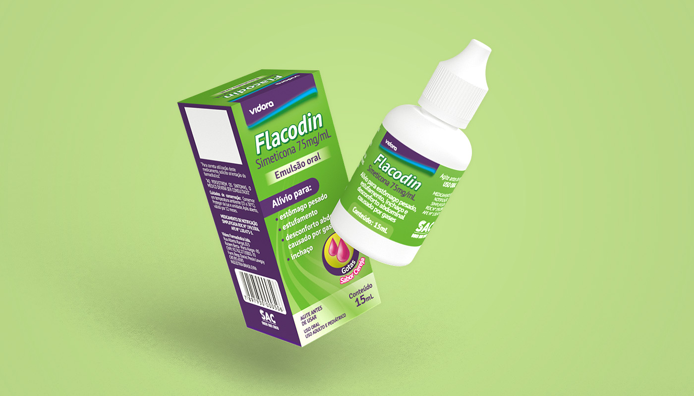
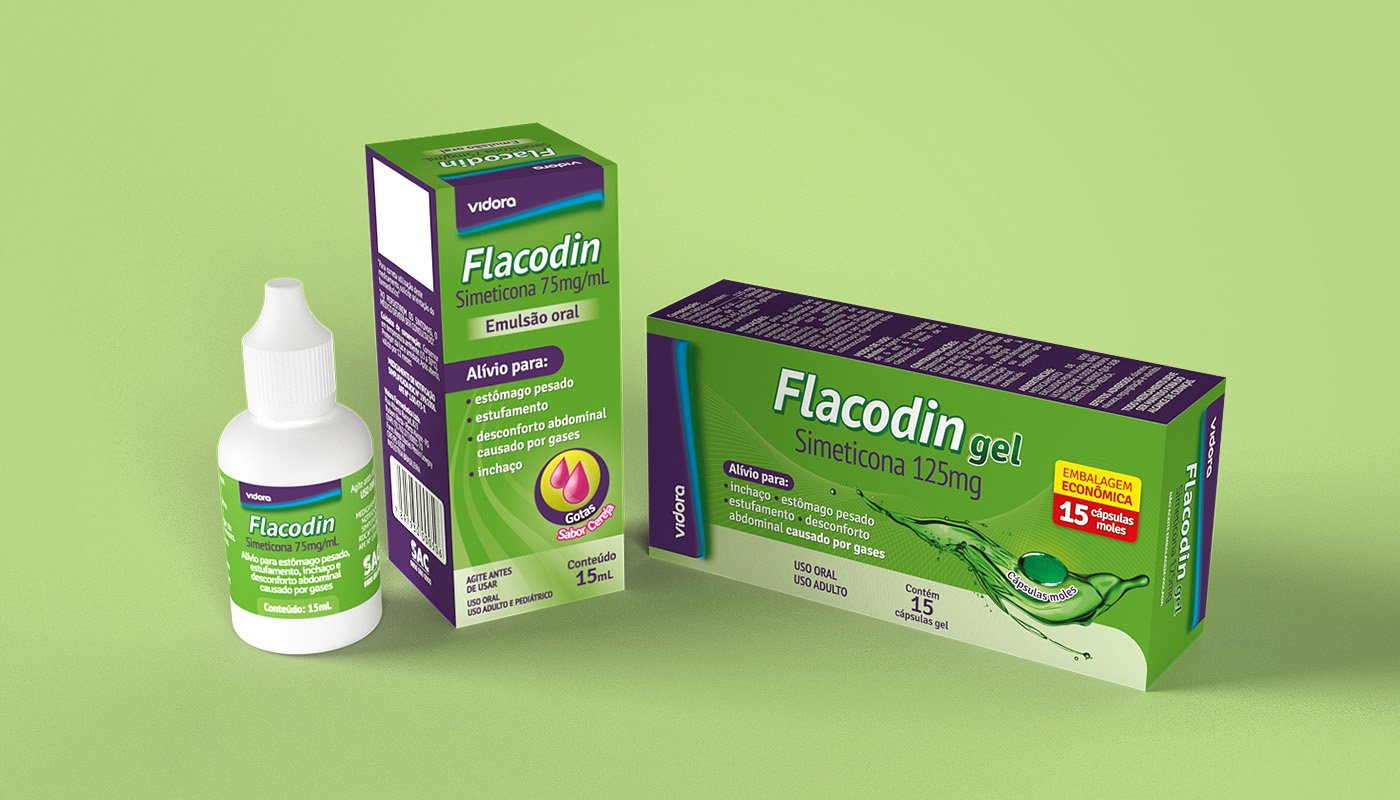
Creation of a pharmaceutical packaging design for two pharmaceutical forms of simethicone: solution and liquid capsules.
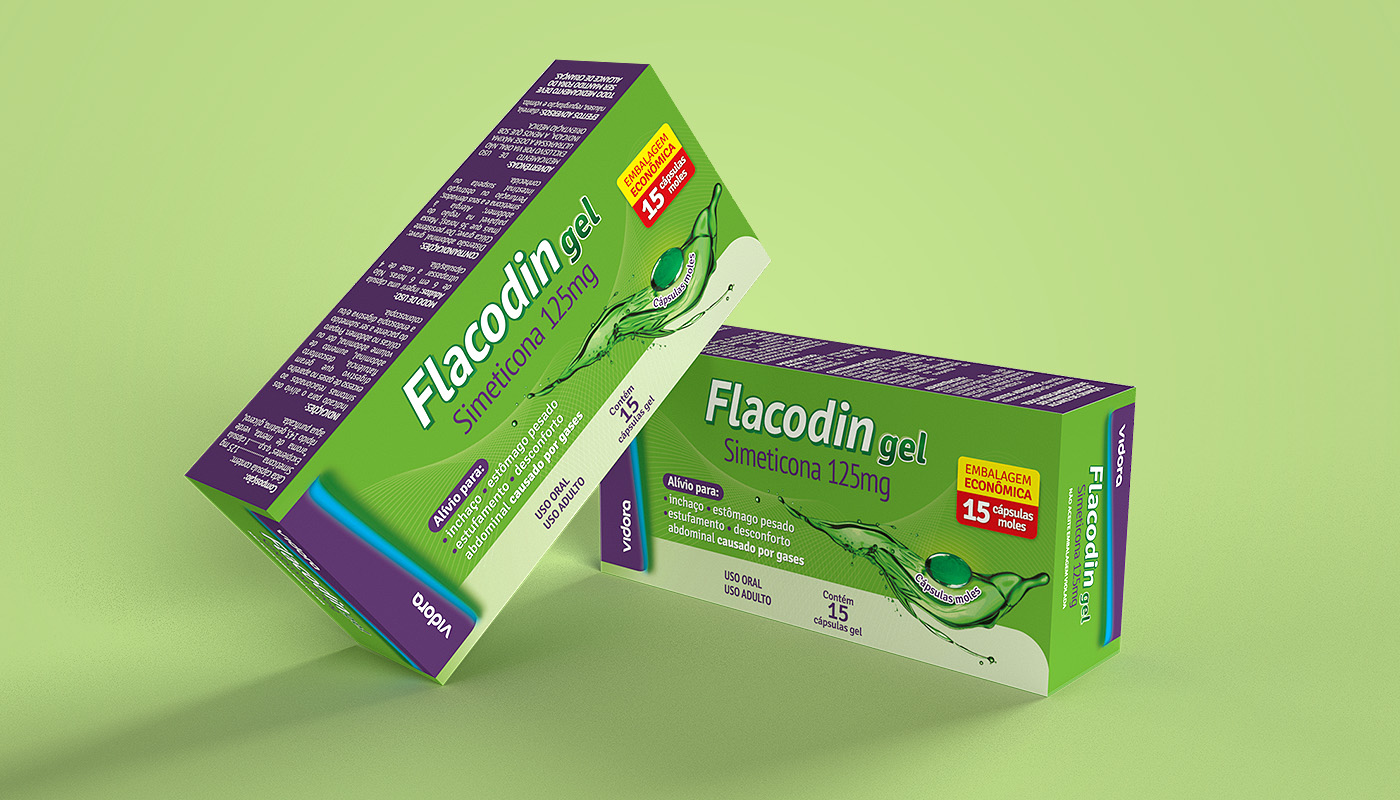

The goal of this project was to create the name and packaging for simethicone under the Vidora brand, for both solution and liquid capsule forms. Simethicone is a medication used in the treatment of flatulence, and this type of product has a well-established visual identity based on the prevalence of the use of the color green.
Packaging Specifications
Box
Material: Folding carton
Finishing: UV coating
Colors: 6×0 (CMYK + Pantone 269C + Pantone 369C)
Bottle
Material: White plastic bottle with dropper and couche paper label
Finishing: –
Colors: 6×0 (CMYK + Pantone 269C + Pantone 369C)
Blister
Material: Aluminium foil
Finishing: –
Colors: 1×0 (CMYK + Pantone 369C)

Printing approval
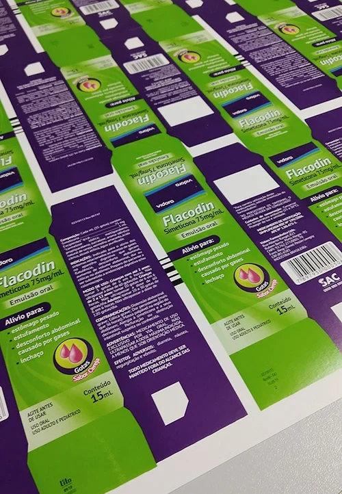
After completing the design, the files were sent to the printing company. The first step in the printing approval process was to approve the digital printing proofs that served as a base for plate preparation.
Next, I was present during the first printing session of each packaging to check the color balance and identify possible design mistakes. Some minor adjustments were suggested regarding the amount of yellow ink, and after calibration, the result was successfully printed and approved.
