Vidora Website
Tools: Illustrator, Inventor, Dimension.
Overview
Challenge
Design Process
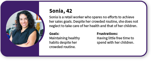
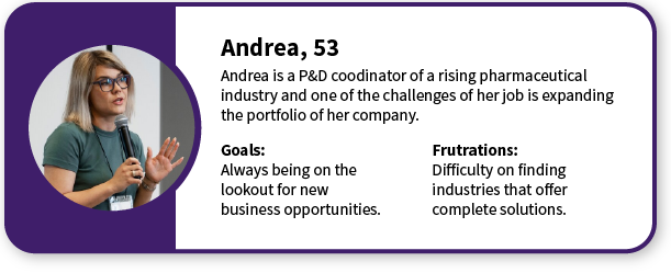
Personas
Competitive Analysis
- Desktop and mobile experience;
- Features and navigation;
- Acessibility;
- Visual design
Product Analysis
Interviews
- reinforce brand identity;
- make the site content more visible;
- more technical content about the company’s industrial plant;
- more information about the products.
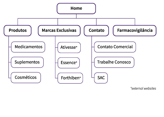
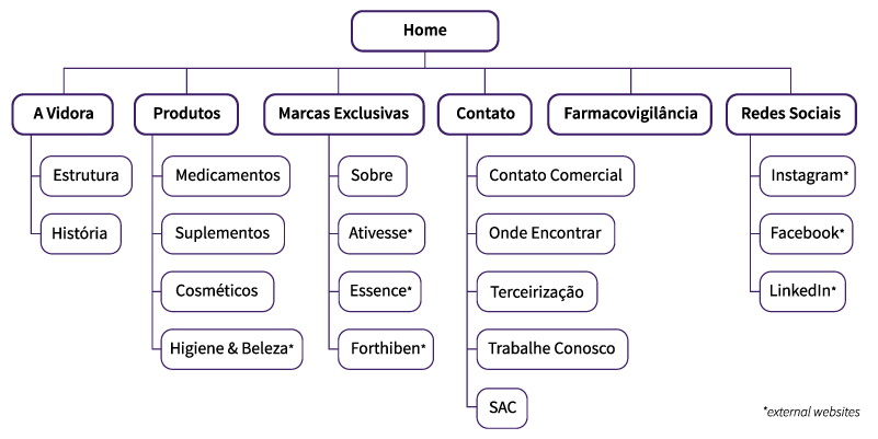
Information Architecture
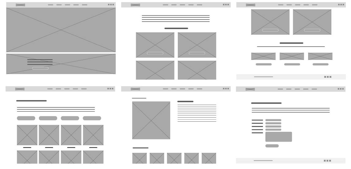
Wireframes

User Experience
Ease for new costumers
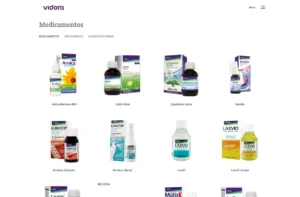
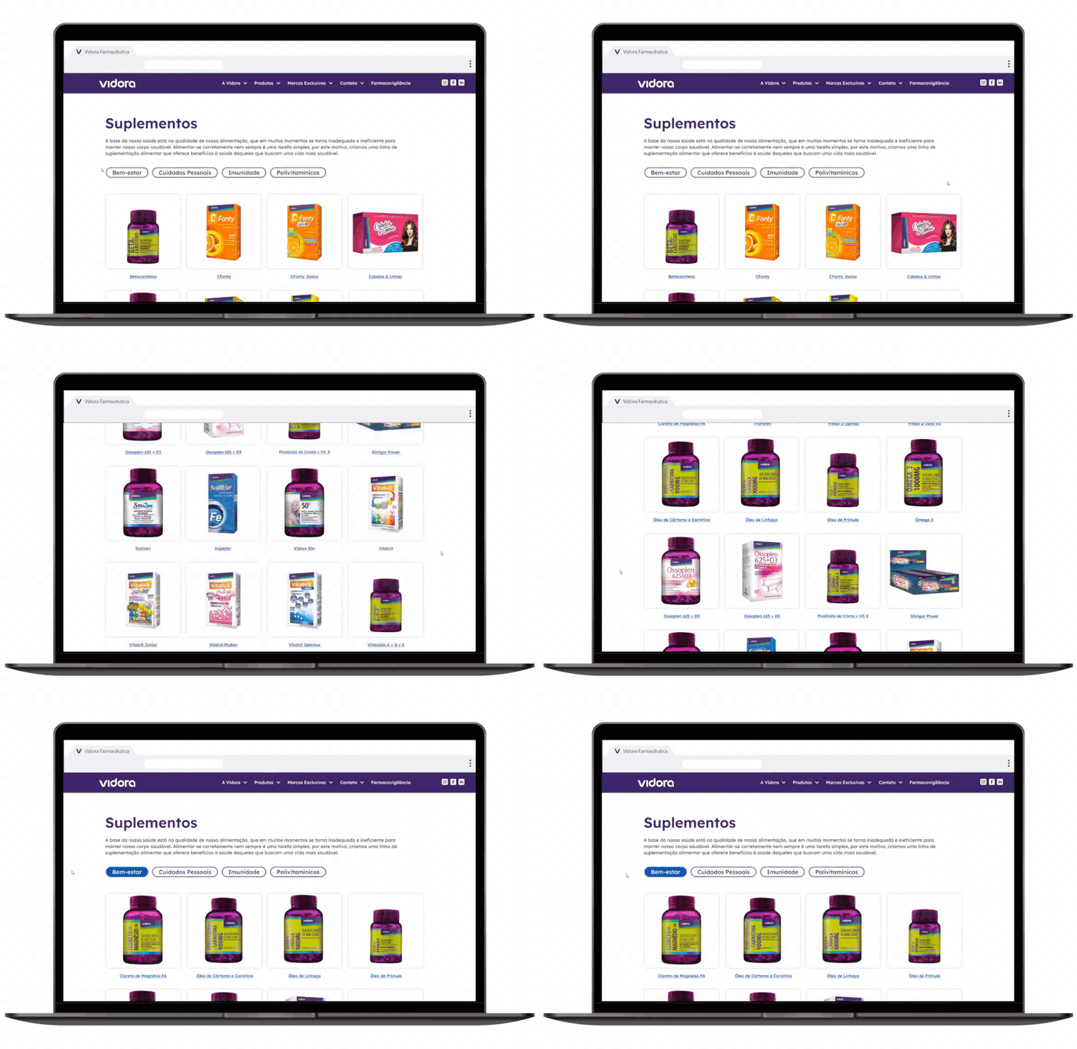
For people that are not used to pharmaceutical products or are looking for a better understanding about the product lines, each product category has filters for a better searching experience.

Faster and simpler contact
To make it easier for customers from all over the country to find the product on their location, a form to register their interest was inserted. Before it, the process usually started with a phone call, in which the consumer called to find out about a product and left their contact for a return. With the form, the request is sent by email along with the contact, speeding up the first step of the process and avoiding possible mistakes that could occur by sharing address on a phone call.
Specifications
Typography
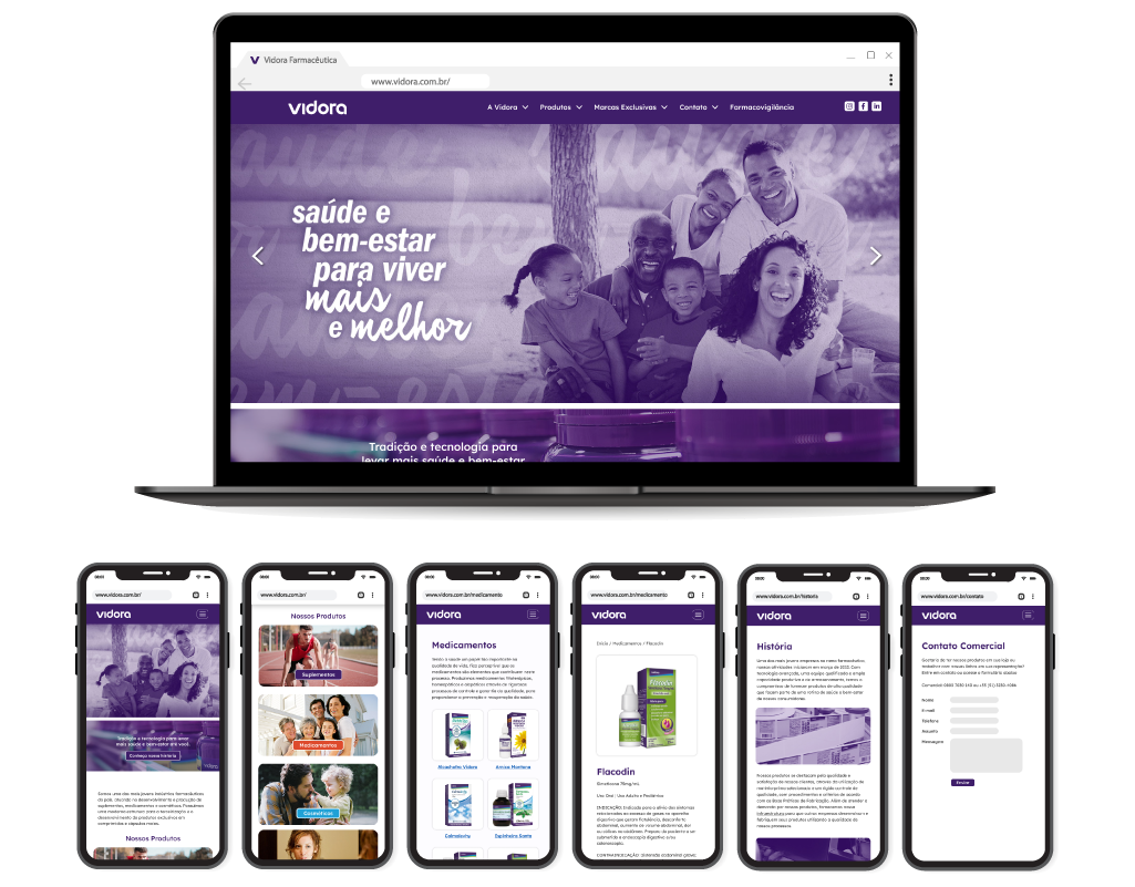
The font family Lexend Deca is used along all the website, which has a resemblance to the company logo with its round design.
Colors
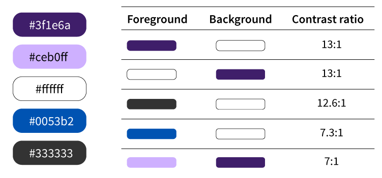
To reinforce the brand identity, the brand’s shade of purple was chosen as the main color for the website header and titles. This shade of purple was already part of the visual consistency maintained by the use of a purple element on the brand packaging (e.g.: Flacodin)
The color scheme provides the necessary contrast between the elements, following the standards on WCAG Guidelines.
