- About
-
Contact
Defining a refreshed look for a traditional vehicle maintenance and repair store
AREA
Brand Design, Webdesign
INDUSTRY
Vehicle services

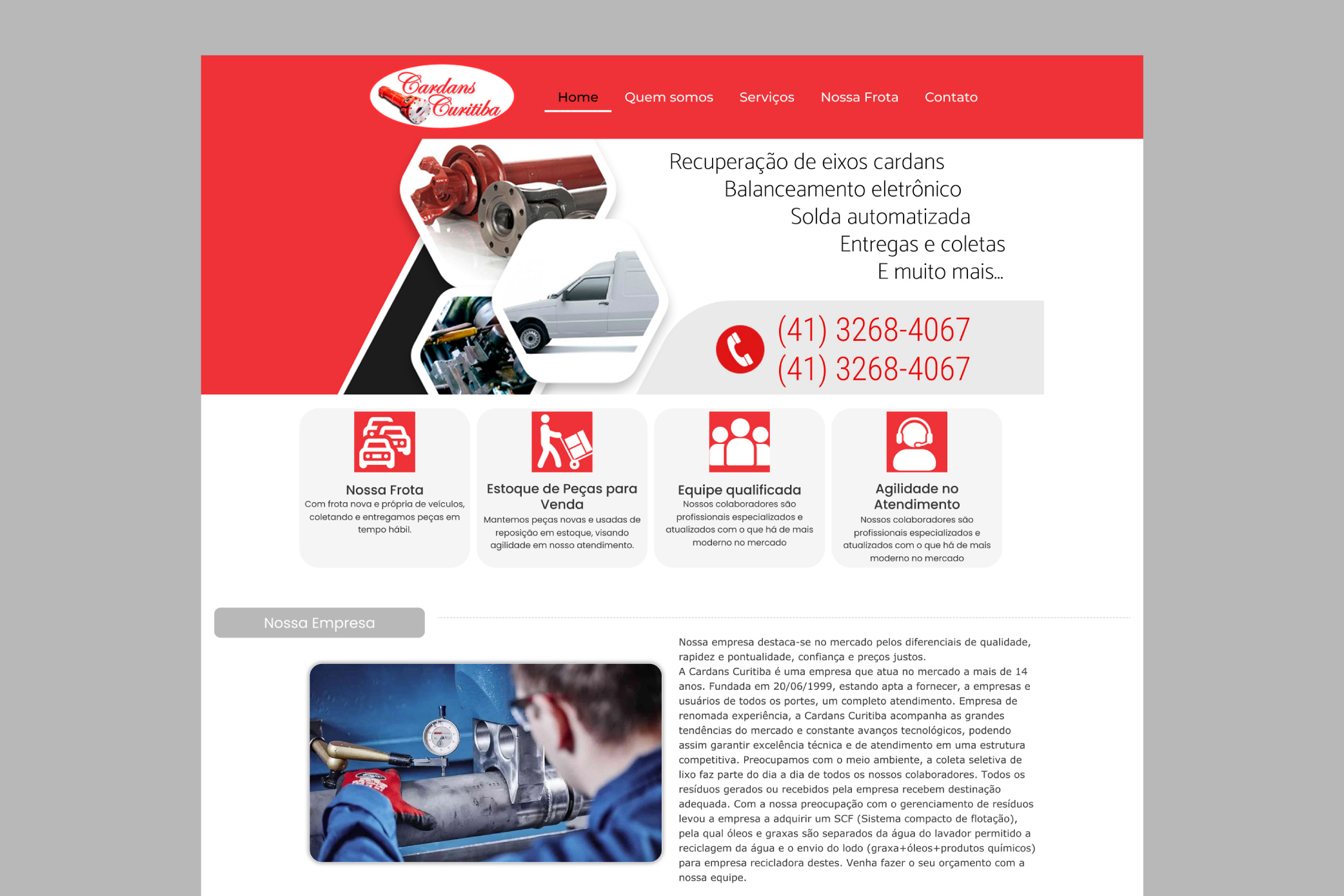
Cardans Curitiba is a traditional vehicle service store at Curitiba, the capital of the state of Paraná, Brazil. With more than 25 years of expertise, it’s a family business especialized in repairing automotive and industrial cardan shafts.

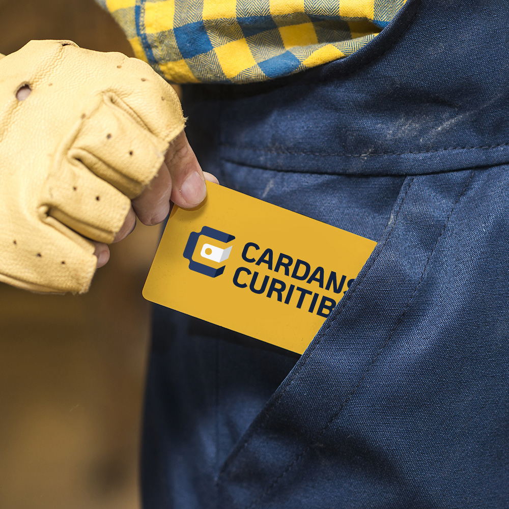


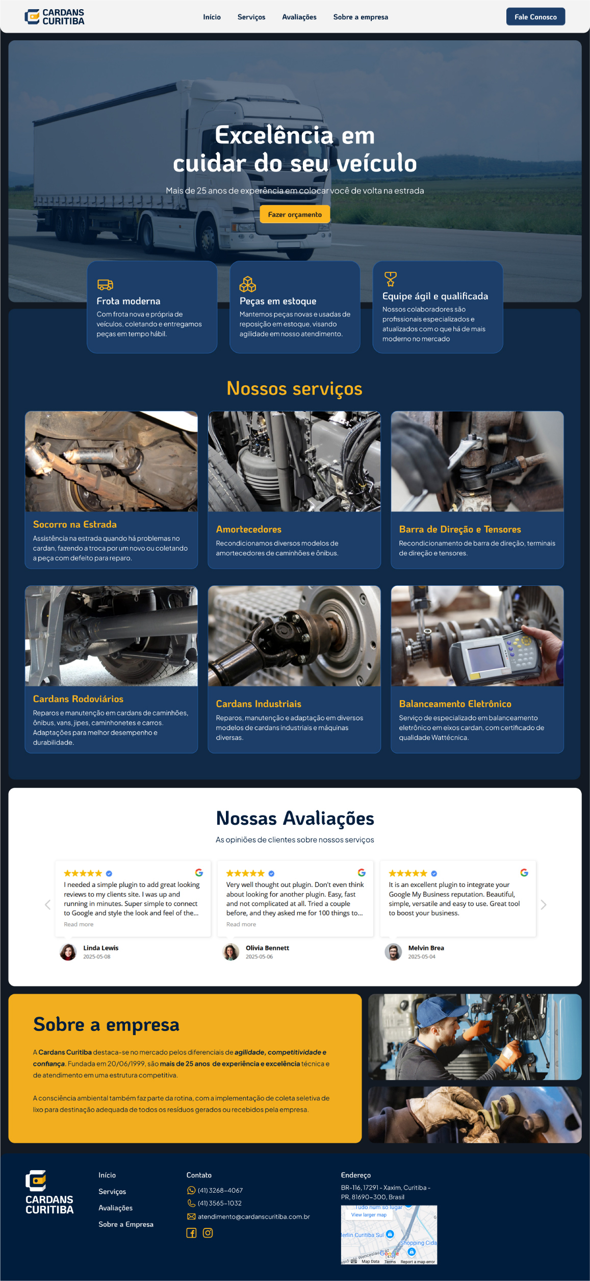
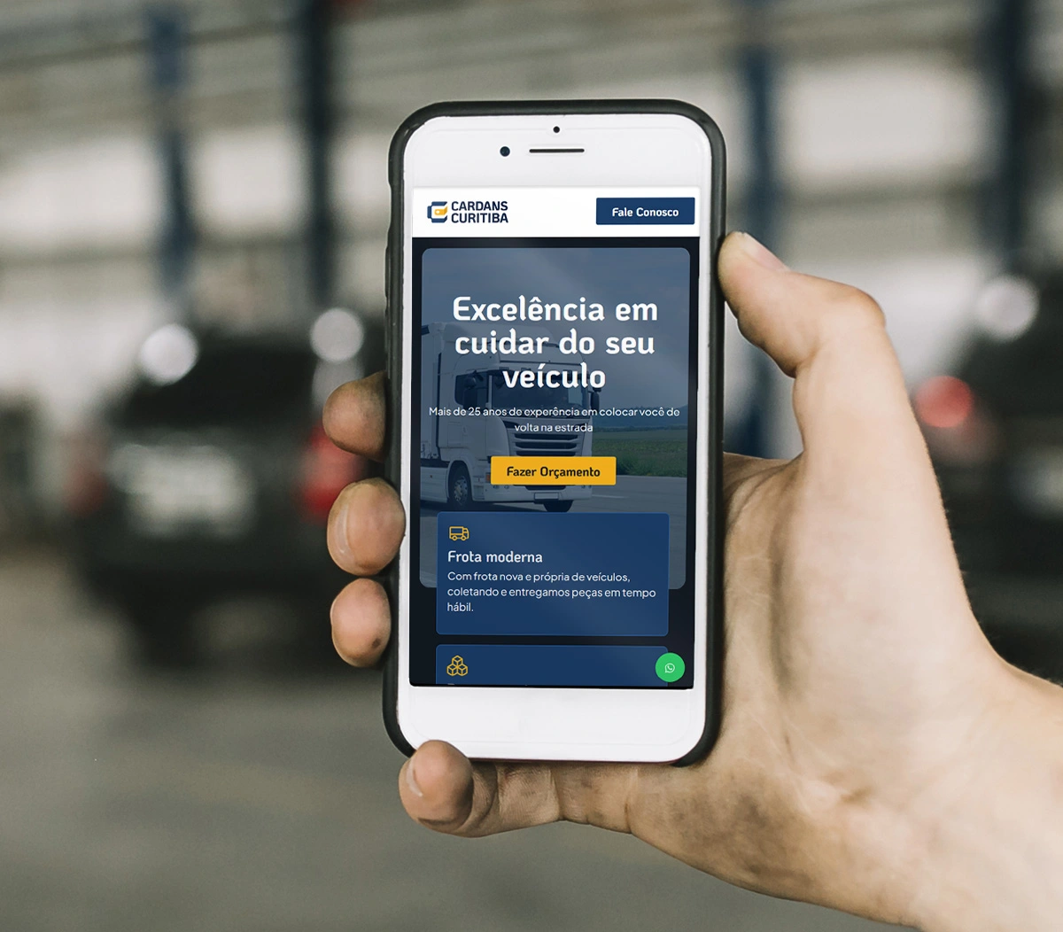
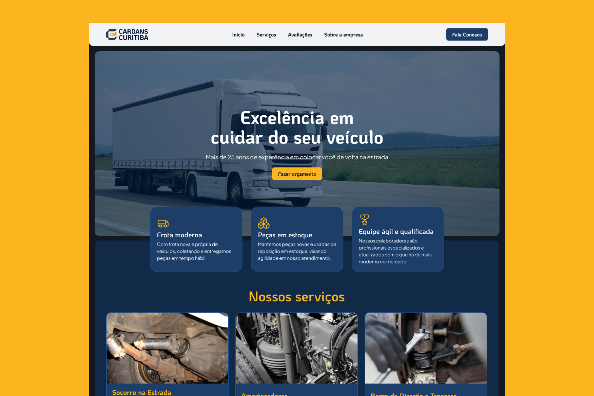
The brand identity was completely redesigned, bringing back the company’s main colors: blue and yellow. Its elements were crafted to give the identity a more robust look, while improving legibility and serving multiple uses, ranging from digital to printed applications.
The website kept its upper structure, advertising all the services in a straight-to-the-point way. Considering that at many times the users may be in distress when searching for car repair, it was important to keep all the content on screen, instead of hiding it behind elements like accordions and carousels. The lower section received a new container with the business’ reviews and the “About” container gained a more polished content.