Tris website

Organizing a colorful universe: redesigning the Tris Website

AREA

Webdesign, Graphic Design

INDUSTRY

Stationery
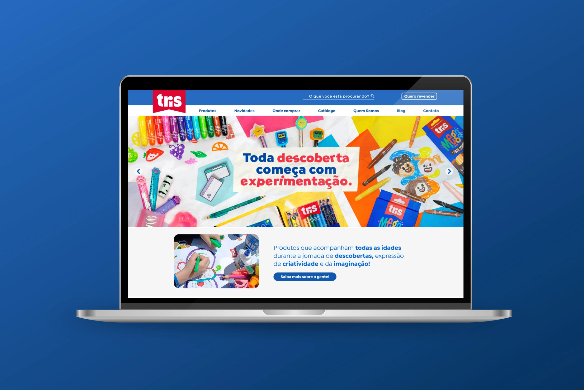
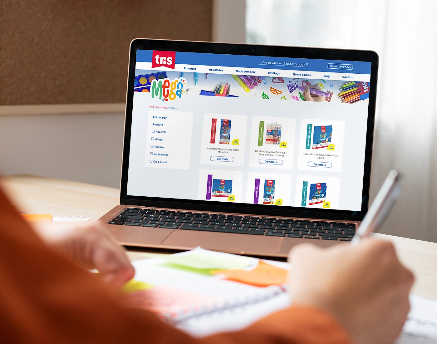
Notebook screen displaying the homepage of the Tris website, which uses a primary color palette dominated by red and blue. The main banner features a bright, colorful photo montage of crayons, markers, and other art supplies surrounding the central text: 'Every discovery begins with experimentation'.

OVERVIEW

“Tris” is a school supply brand that offers a big variety of products to make the school, office and study routine more fun, colorful and creative.

On this project I was responsible for the web and mobile prototypes on Figma. It started with a draft of the main page, created by a former colleague, which was refined by me and served as the main visual concept for the rest of the pages.

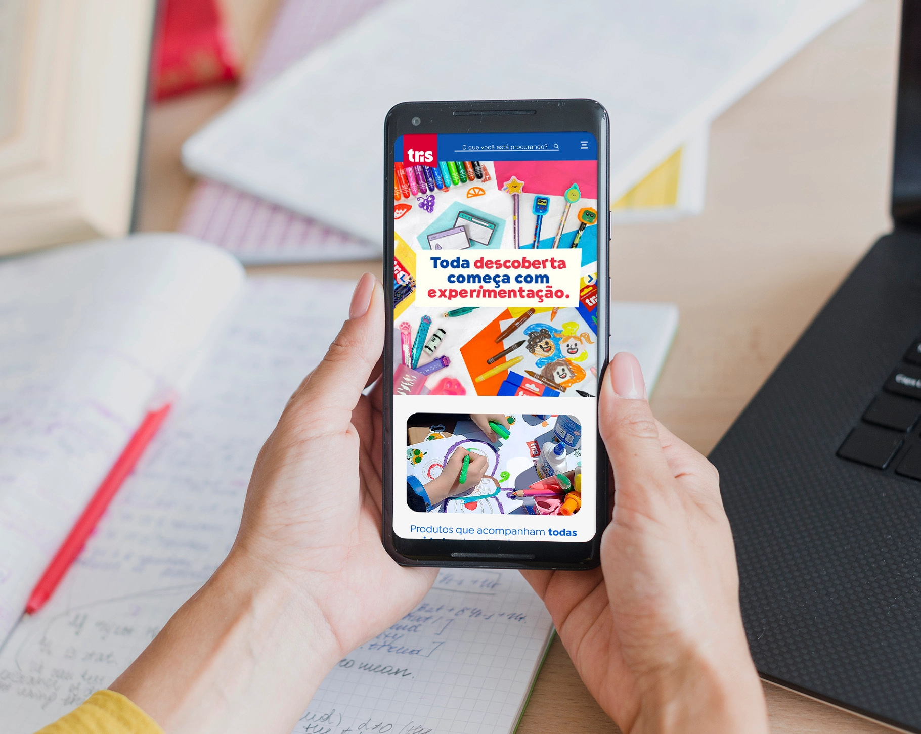
Person holding a smartphone displaying the homepage of the Tris website, which uses a primary color palette dominated by red and blue. The main banner features a bright, colorful photo montage of crayons, markers, and other art supplies surrounding the central text: 'Every discovery begins with experimentation'.
Mobile view of the homepage

CHALLENGE

Bringing the printed catalogue “spirit” to the website: exploring the products’ visuals, reinforcing the brand’s identity on its online presence.
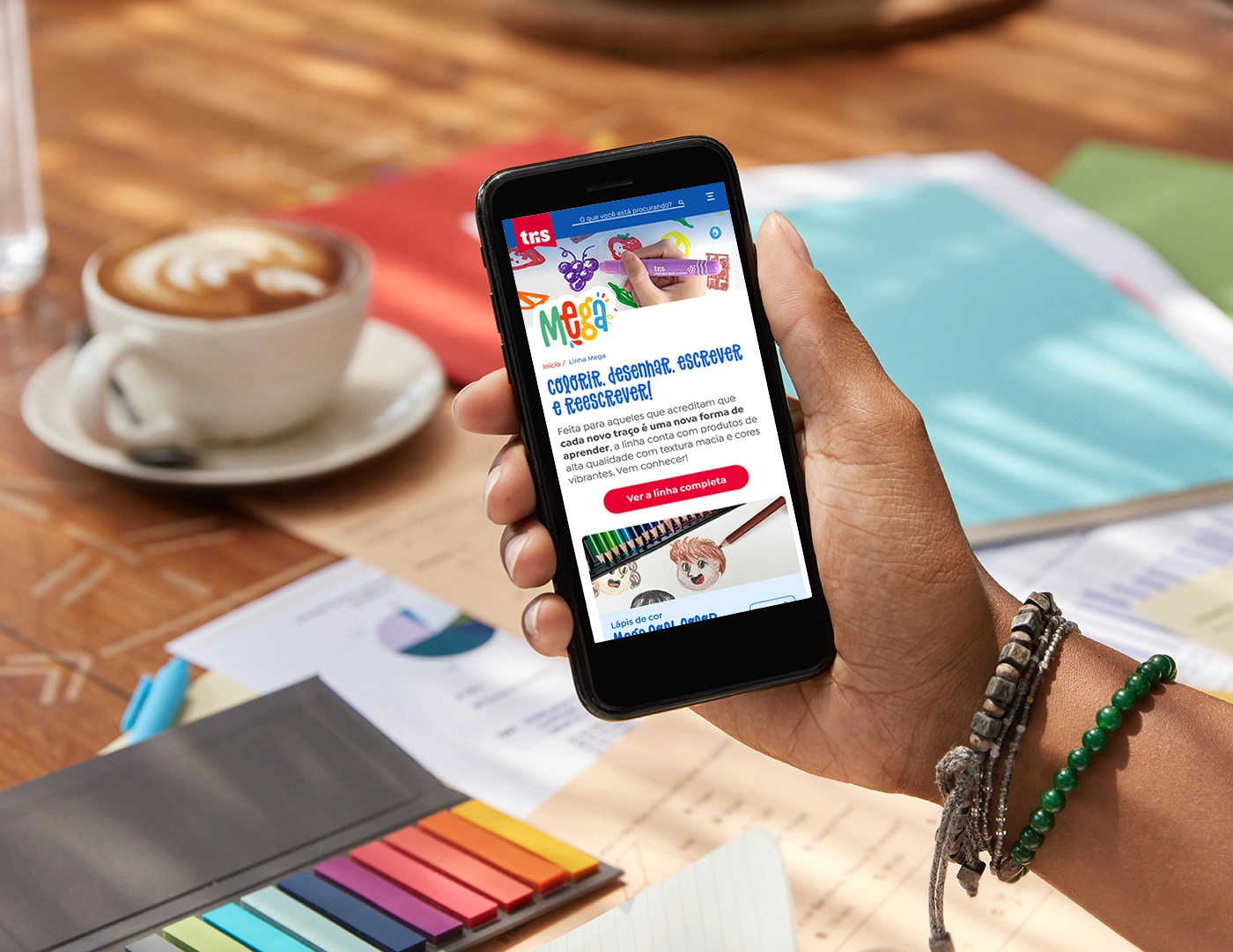
Person holding a smartphone displaying the 'Tris Mega' sub-brand page, with its headline 'Color, Draw, Write, and Rewrite!', a description of its purpose and a button to access all its products
Mobile view of the Tris Mega sub-brand page

RESEARCH

In order to understand user behavior, I analyzed around 1 year of data (October/2022 – October/2023) recorded through Microsoft Clarity. There was a total of 94.518 sessions on this period, a great database to understand the experience of consumers while navigating the website.

With different types of data, like absolute numbers, heatmaps, sessions recordings and scroll depth of the main pages, I was able to define key points of change to improve the user experience on whichever device they use.
Website sessions (all pages)
94.518
Average scroll depth
53,84%
Average active time
1 min
Some stats about the website displayed on Clarity
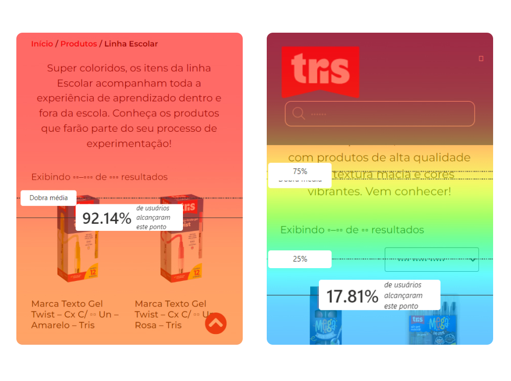
Screencaptures of heatmaps showing the diffrence on scroll depth: on the left, a page showing that 92.14% of users reached the products grid; on the right, a page showing that only 17.81% reached the products grid
Difference of scroll depth for sub-brand pages: Tris School vs. Tris Mega
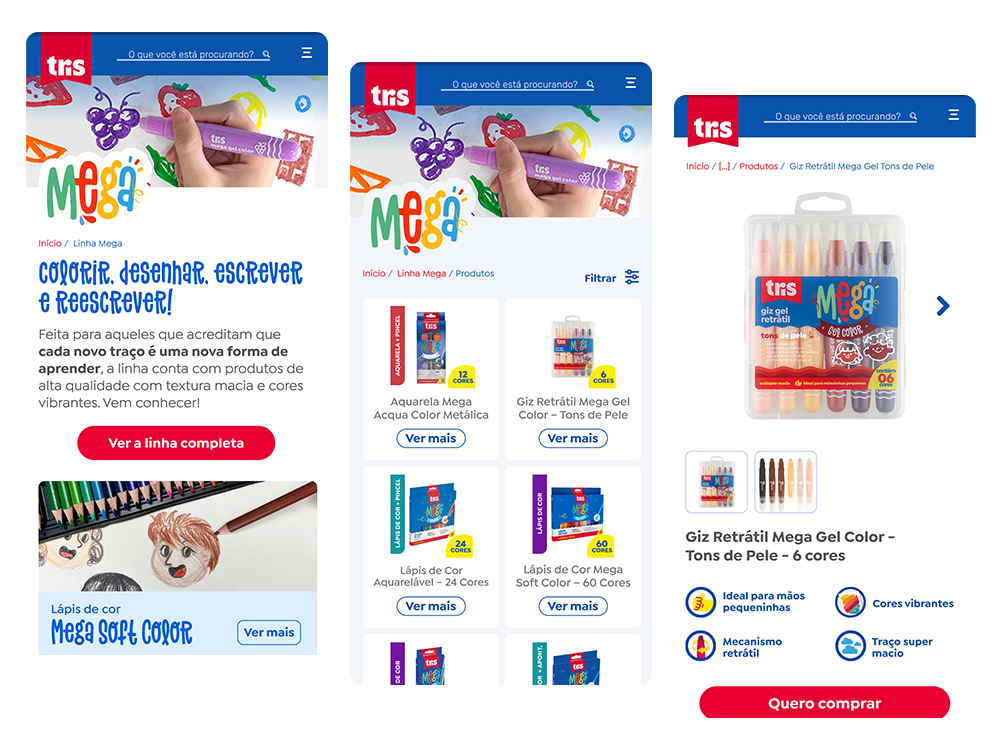
Three mobile screens from the Tris website regarding the Mega sub-brand. The first screen (left) shows the Mega homepage, with the title 'Color, Draw, Write, and Rewrite! and a red 'View the full line' button. Below, there is a preview of the 'Mega Soft Color Pencils' line. The second screen (center) displays the list of products within the Mega sub-brand organized in a grid. The third screen (right) displays the specific product page for the 'Mega Retractable Gel Crayon – Skin Tones', showing an image of the kit and highlighting its features.
Mobile view of Mega page, products grid and Mega Gel product page