- About
-
Contact
Organizing a colorful universe: redesigning the Tris Website
AREA
Webdesign, Graphic Design
INDUSTRY
Stationery
OVERVIEW
“Tris” is a school supply brand that offers a big variety of
products to make the school, office and study routine more fun, colorful and creative.
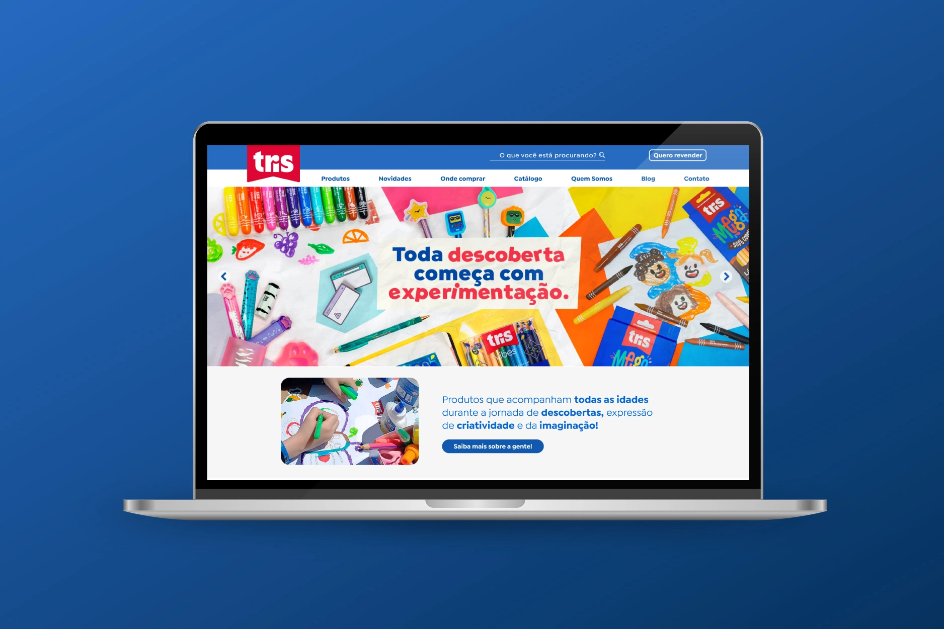
The project started with a draft of the main page, created by a former colleague, which was refined by me and served as the main visual concept for the rest of
the website.
CHALLENGE
Bringing the printed catalogue “spirit” to the website: exploring the products’ visuals, reinforcing the brand’s identity on its online presence.
RESEARCH
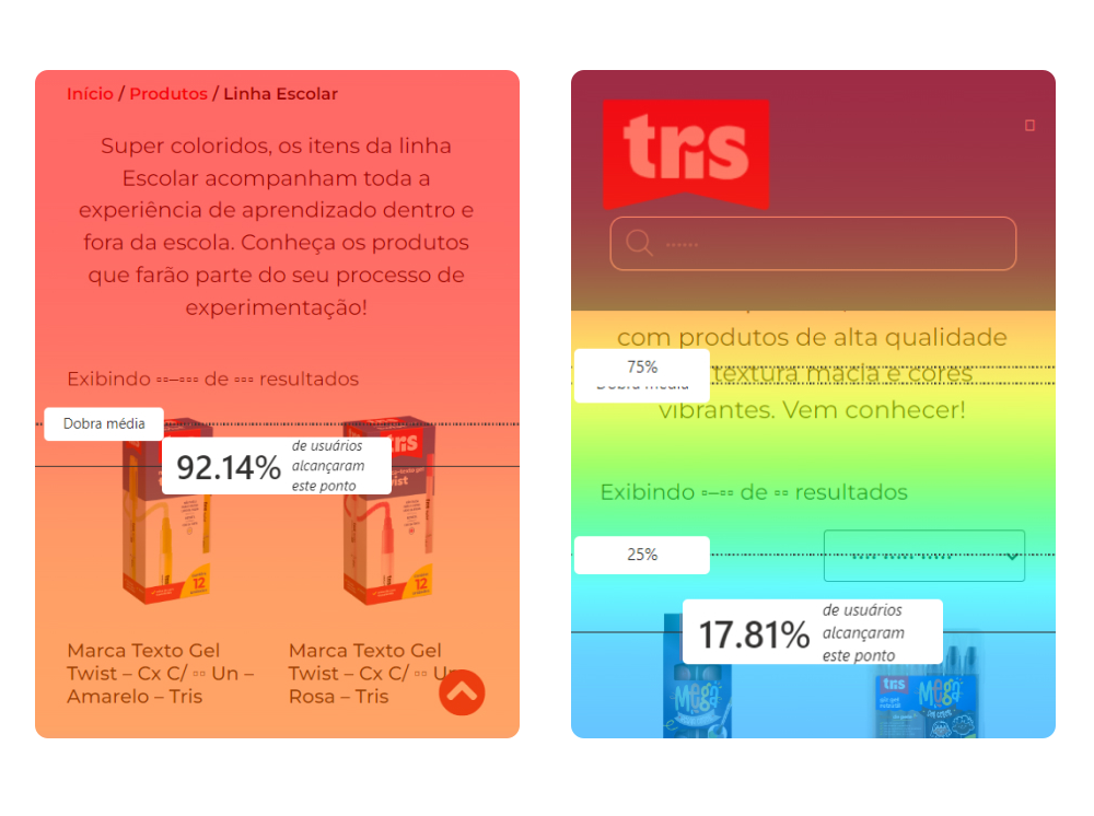
In order to understand user behavior, I analyzed around 1 year of data (October/2022 – October/2023) recorded
through Microsoft Clarity. There was a total of 94.518 sessions on this period, a great database to understand the
experience of consumers while navigating the website.
With different types of data, like absolute numbers, heatmaps, sessions recordings and scroll depth of the main
pages, I was able to define key points of change to improve the user experience on whichever device they use.
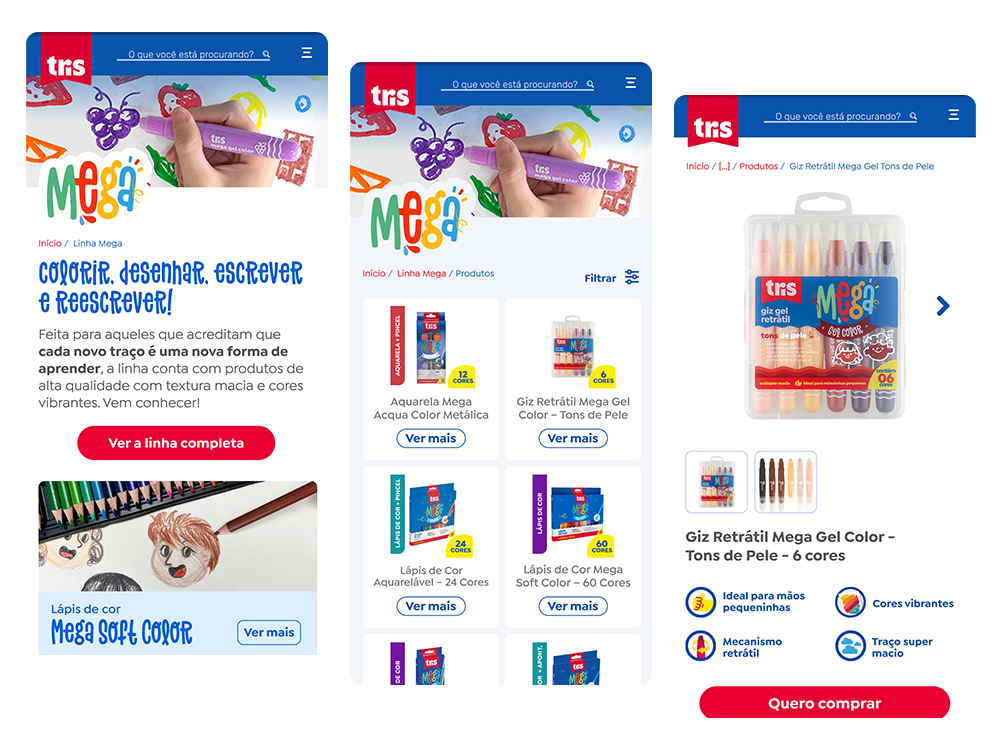
MAIN CHANGES
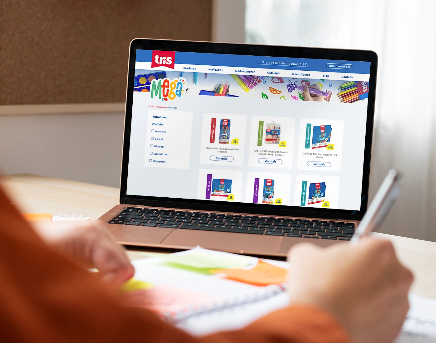
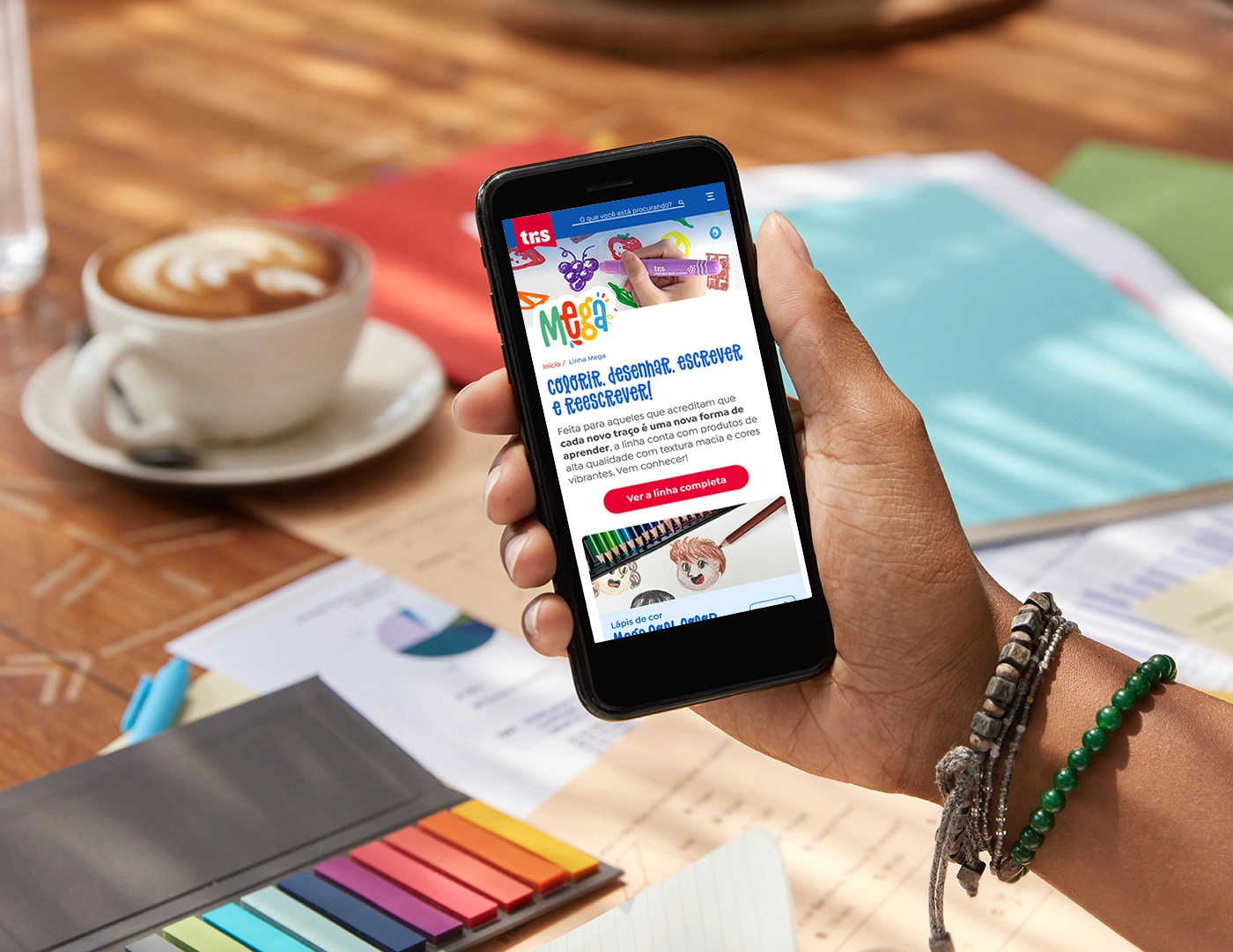
→ New product categories: The product categories have been reorganized to enhance product discoverability.
→ Reduction of text: Large blocks of text have been shortened to make more room for products above the fold.
→ Visual resources: The focus has shifted to product photos and icons to improve scannability and user engagement.